
How to Batch Resize Images Online (No Software Needed)
Why Batch Resizing Matters
Serving a 4000-pixel-wide photo in a 400-pixel container is the most common image performance mistake on the web. The browser downloads megabytes of data it never displays, dragging down load times and Core Web Vitals. Resizing images to their display dimensions is the single fastest win for page speed - and doing it in bulk saves hours.
When you have dozens or hundreds of images from a photoshoot, product shoot, or content migration, resizing them one by one in a desktop editor is tedious. Batch resizing online - without installing software - is the practical solution.
The Problem with Desktop Tools
Traditional image editors (Photoshop, GIMP, Affinity) are powerful but inefficient for bulk resizing:
Online batch resizers solve this, but many upload your images to remote servers - a privacy risk and a bottleneck for large files.
A Better Approach: In-Browser Batch Resizing
Our bulk image resizer processes everything in your browser using WebAssembly and Web Workers:
No software install. No upload. No sign-up. Your images stay on your device the entire time.
Maintaining Aspect Ratio
The most important rule of resizing: never stretch or squash an image. Always preserve the original aspect ratio to avoid distortion.
When you specify a target width, the height is calculated automatically:
``
newHeight = (originalHeight / originalWidth) × newWidth
`
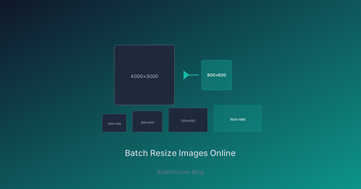
For example, resizing a 4000×3000 photo to 1200px wide produces a 1200×900 image - the same 4:3 ratio, just smaller.
Our tool handles this automatically. You set one dimension, and the other scales proportionally. If you need exact square thumbnails (e.g., 400×400 for product grids), the tool can crop to fill while preserving the subject.
Common Web Size Presets
Different contexts call for different dimensions. Here are the standard sizes we recommend:
| Use Case | Dimensions | Format |
| Open Graph (social sharing) | 1200×630 | JPEG/WebP |
| Blog featured image | 1200×630 | WebP |
| Product thumbnail | 400×400 | WebP |
| Product zoom | 1600×1600 | WebP |
| Hero banner (desktop) | 1920×1080 | WebP/AVIF |
| Hero banner (mobile) | 750×1334 | WebP |
| Blog content image | 800px wide | WebP |
| Email header | 600×200 | JPEG |
| Favicon | 32×32 / 64×64 | PNG |
| Avatar | 200×200 | WebP |
For retina displays, multiply the display size by 2. A 400×400 thumbnail should be served at 800×800 so it stays sharp on high-DPI screens.
Resizing and Converting in One Step
The most efficient workflow combines resizing with format conversion. Instead of resize-then-convert (two passes), do both at once:
This single step can reduce a 4MB JPEG to a 60KB WebP - a 98% reduction - while fitting it to the exact display size. For more on this combined workflow, see our batch WebP conversion guide.
Resizing for Responsive Design
Modern responsive design serves different image sizes to different screens. Instead of one image for all devices, generate multiple resolutions:
Use the srcset attribute to let the browser choose:
`html
``
Generate all three sizes in one batch by running the converter three times with different target widths - or use a script to automate the loop. Each pass takes seconds thanks to parallel processing.
Tips for Best Results
Resize Before Compressing
Always resize first, then apply compression. Compressing a 4000px image and then resizing it wastes encoding effort on pixels you will discard. Resizing first means the compressor works on fewer pixels - faster and more effective.
Avoid Upscaling
Never resize an image larger than its original dimensions. Upscaling adds no real detail and produces blurry output. If you need a larger image, re-shoot or find a higher-resolution source.
Watch for Orientation Metadata
Some photos store rotation in EXIF data. When resizing, ensure the tool respects EXIF orientation so portraits do not come out sideways. Our converter handles this automatically.
Real-World Impact
A travel blog with 80 full-size photos (average 3.5MB each) resized and converted to WebP at 800px:
| Metric | Before | After | Improvement |
| Avg image size | 3.5MB | 65KB | -98% | ||||
| Total page weight | 280MB | 5.2MB | -98% | ||||
| Page load (4G) | 38s | 3.2s | -92% | The entire batch of 80 images processed in under 30 seconds, entirely in the browser. Start Batch ResizingResize hundreds of images at once with our free bulk image resizer - no install, no upload, no watermark. Set your dimensions, preserve aspect ratio, and download as a ZIP. For the full performance picture, see our guide on reducing image file size for websites. Common Resize Scenarios | Platform | Recommended Size | Aspect Ratio |
| Shopify product | 2048×2048 | 1:1 |
| WordPress featured | 1200×630 | 1.91:1 |
| Instagram post | 1080×1080 | 1:1 |
| Twitter/X header | 1500×500 | 3:1 |
| Facebook cover | 820×312 | 2.63:1 |
| Open Graph meta | 1200×630 | 1.91:1 |
Related Guides
Ready to optimize your images?
Try BulkPicConv — Free